There are many extreme numbers being generated by the current panic in the markets. Since this blog emphasizes volatility, I wanted to share one that takes a long-term view of volatility: the SPX:VIX ratio.
In the chart below, I have created a graphic which tracks the ratio back to the first VIX data from 1990. In addition to the ratio (black line) and SPX (gray area chart), I have also included a blue line that represents a 10% long-term trend line for the SPX (for additional information, try The SPX:VIX Relationship). The key takeaway is that the SPX:VIX ratio is now farther below the trend line than it ever has been during the 19 years of VIX data.
Incidentally, the SPX:VIX ratio has been declining steadily since January 2007, some 21 months ago. As long as the 2000-2002 bear marked seemed, the SPX:VIX ratio trended down only three months more (24 months) during that bear stretch.
The SPX:VIX ratio tends to be mean-reverting around the long-term trend line, but as the graphic shows, the path back to the mean can be a long and difficult one.
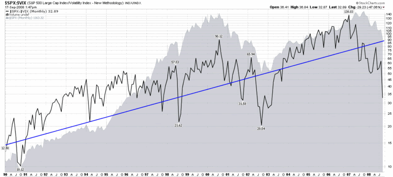
[source: StockCharts]
The chart ends at mid-2006? What about mid-2006 to present?
ReplyDeleteThe chart ends at mid-2006? What about mid-2006 to present?
ReplyDelete