When it comes to implied volatility charts, I normally use the charts from two of my favorite options brokers: thinkorswim and optionsXpress. On the other hand, this blog is littered with IV charts from iVolatility.com, largely because these charts are freely available on the web and because the look and feel is relatively clean and uncluttered.
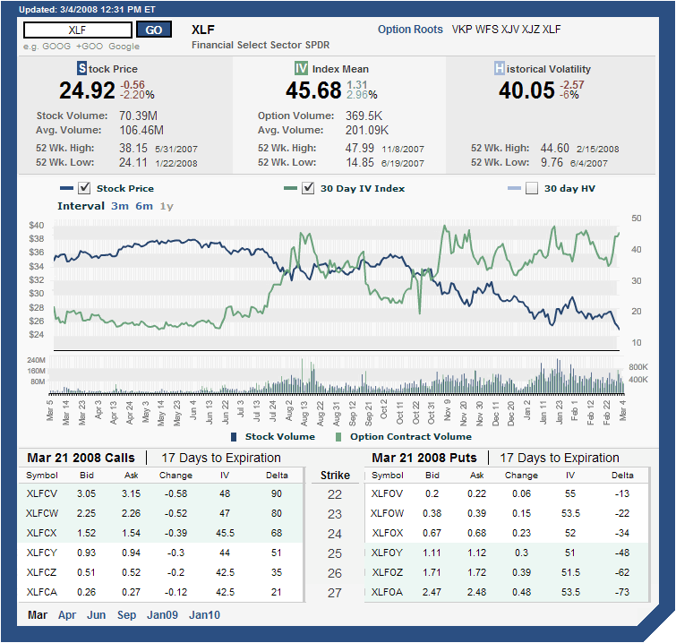
For a visual change of pace, I suspect I will soon start posting some of the excellent thinkorswim charts, but for those wishing to roll their own, I want to offer a strong recommendation for the implied volatility charts put out by the ISE. When it comes to the ISEE charts on the ISE site, I am often frustrated by the poor graphics, but the ISE charts for individual securities are excellent. An example of one of the ISE’s volatility charts is the one I have included for XLF below. These charts can be customized to a time frame of 3 months, 6 months or 12 months and allow users to specify, via check boxes, any of stock price, implied volatility, and 30 day historical volatility (I have historical volatility turned off here.) As you can see from the graphic below, there is a lot of information crammed into these charts, including daily stock and option volume (easier to read in the shorter time frames), as well as a fair amount of volatility data. All data is delayed by 20 minutes, but as far as I am concerned these are the best free volatility charts out there.
To generate your own volatility charts at ISE, try their Quotes/Volatility page.
[source: International Securities Exchange]
I like their charts, but what is it with this trend of using black and green lines? They're not the only site that does this. Very hard to distinguish those two colors from each other. Why not use red?
ReplyDeletevery interesting charts, never saw before.
ReplyDeletedo crossovers in price and IV create any trade opportunities in your experience?
Mezameo,
ReplyDeleteI would say that any trades of the type you suggest would be random chance at best -- and one of the reasons would be the whims of the Y-axis scales. Change these and you get a whole new set of signals...
Interesting question, though.
Cheers,
-Bill