Given all the requests I have to update the table below, I guess it is time to come to terms that the SPX Peak to Trough Summary Chart is going to be a regular feature on the blog for the time being.
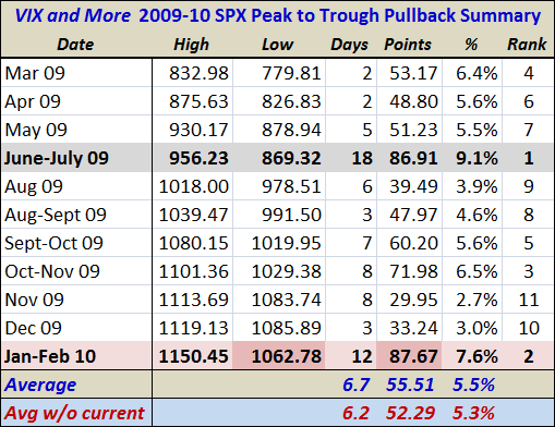
This time around I have made a couple of minor changes. First, the 9.1% pullback of June-July 2009 is now highlighted in gray and the current pullback is highlighted in light red. Second, I have highlighted in a darker red those cells which indicate the current selloff has reached an important threshold. In the case of today’s low of 1062.78, the highlighting reflects the fact that the low is now below the much shallower lows from November and December. Of course, a pattern of lower lows will likely encourage additional selling and set the stage for a possible test of the next important support level in the area of SPX 1030-1035.
The other cell I highlighted reflects the 87.67 points that have been lost from peak to trough over the course of the last 12 trading days. In absolute terms, this makes the current pullback the largest since the beginning of the March 2009 rally. My preferred measure is not points but percentages, which ranks the current 7.6% pullback as #2 behind the June-July 2009 selloff.
Knowing where the current pullback sits in historical terms does not necessarily help forecast where and when it will end. It does reinforce the point, however, that if the SPX closes below 1030 that we should begin talking about a bear market instead of a pullback. For the record, the 200 day moving average should be up to 1030 in about two weeks, at which point the SPX will also be fighting a rising moving average tide in order to remain technically bullish.
For related posts on these subjects, readers are encouraged to check out:
Disclosures: none