In the 31 weeks since the launch of the chart of the week feature, I have created all the charts with the exception of (I believe) two of them. Going forward, I think it is time to relax this constraint a little and expand the scope of the chart of the week feature to cover a broader range of subjects, bring in a little more visual variety, etc.
What better way to usher in an expanded chart of the week feature, but with a heat map of the second quarter performance of the S&P 500, particularly when the 15% gain in the quarter was the best for the index in eleven years. The FINVIZ.com heat map breaks down the quarterly performance at the component level, grouped by sectors and industries, with the size of the squares being proportional to market capitalization and the color codes (and numbers) representing quarterly performance.
FINVIZ.com has a large number of heat maps available and is a site that is well worth exploring.
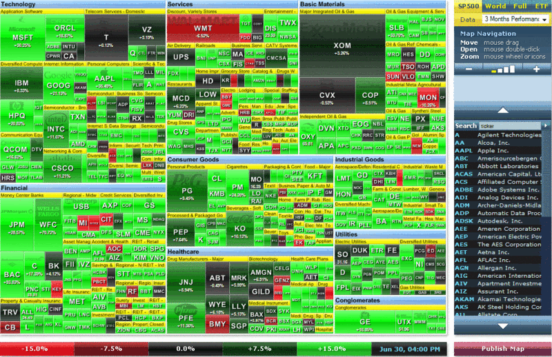
[source: FINVIZ.com]
Awesome! Thanks!
ReplyDelete