Rather than a bunch of statistics, I thought the chart below might help. It identifies the six previous instances since 1950 in which the ISM index dipped as low as the current level.
Not surprisingly, historical precedent recalls a number of difficult economic periods. What I find particularly interesting is that, consistent with the belief that stocks are a leading indicator, when the ISM bottomed, this was often after stocks had made a substantial move off of their eventual bottom.
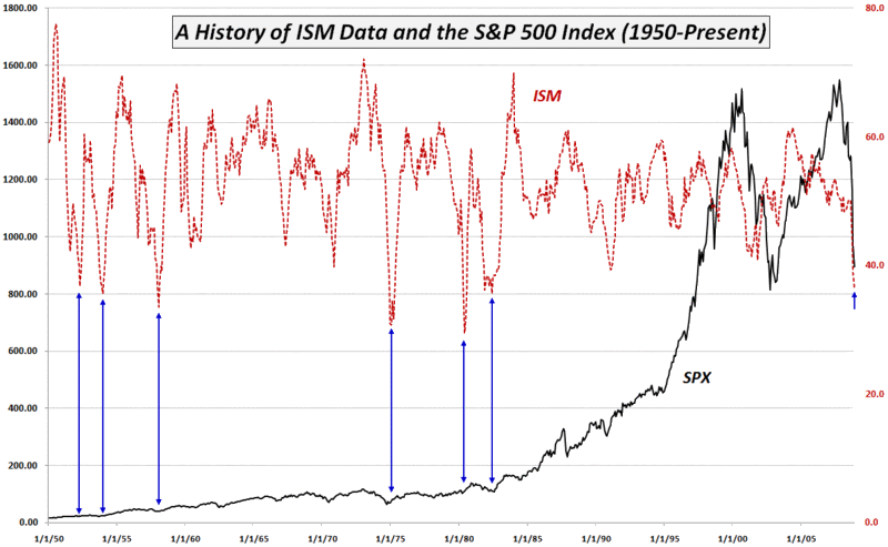
[source: Institute for Supply Management, VIX and More]
Using a logarithmic S+P might be a better display of data.
ReplyDeleteYep, I'm expecting some uplift pretty soon, but these are pretty special times. I usually refer to the ECRI Weekly Leading Index for this kind of analysis. the weakness of that is the fact that a stock averages is part of the WLI composite, so there is autocorrelation by definition. where did you get the ISM data?
ReplyDeleteTaiwanTim
Anon,
ReplyDeleteI agree on the use of a log scale.
Taiwan Tim,
The ISM data comes from the St. Louis Fed
Cheers,
-Bill