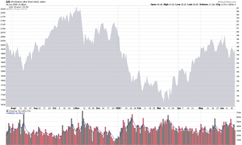
The week’s trading volume has been on the thin side, particularly for an options expiration week. Of course, not all volume is created equal.
One the areas of the investment world where I pay close attention to volume is double inverse ETFs, which include the UltraShort ETFs pioneered by ProShares. The double inverse ETFs are an attractive set of investment vehicles for speculative bears to place their bets, because the oversized payoff if they are correct.
Of the double inverse ETFs, I am particularly fond of the QID, the double inverse ETF for the NASDAQ-100 index (NDX). The QID has captured the imagination of many retail investors who are not particularly comfortable going short, but have no qualms about making a bearish investment by going long an inverse ETF. Volume patterns in this ETF demonstrate that the QID can be an effective contrarian indicator. Take the chart below, for example, where a 5 day EMA of the volume has been a good indicator of tops in the NDX (the gray area chart on the top) when it rises above the 45-50 million share level.
In a broader sense, ETFs are opening up a new frontier for those who are interested in market sentiment. I will be sharing some of my thinking in this area in the weeks and months ahead.

Today QID is about 60 million... top for NDX? But then qqqq made a bullish engulfing... so bullish? OE tomorrow... is going to be wild...
ReplyDeleteI am confused about your chart, the QID is trading at 40 and looks nothing like that, what is your chart showing?!?!!?
ReplyDeleteHi Sia,
ReplyDeleteMy apologies for not properly explaining the chart, which is a hybrid of NDX price and QID volume. The gray area chart on top is for the NDX and uses the scale on the left; the volume bars on the bottom are for the QID.
The confusion is partly due to the fact that the text of the chart and the right Y-axis scale reference the QID (which I have put in 'invisible' mode, if you are familiar with StockCharts.com). I want the comparison to be between the NDX and the QID volume. Sure, the QID volume also works with calling tops and bottoms in QID price trends, but since the NDX is the underlying, I chose to display that index instead of the QID.
Sorry for any confusion.
Cheers,
-Bill
Thanks!
ReplyDeleteBill,
ReplyDeleteI don't see the pattern you're talking about. I sort of see up volume spikes at tradable bottoms possibly but I can't say I'd trust this indicator.
Maybe you can further explain the correlation you've found.
Thanks,
Marc
Hi Marc,
ReplyDeleteThe purpose of today's post was mostly as a visual thought starter. Perhaps in the future I will return with some more rigorous statistical analysis and/or thoughts on entries and exits.
Cheers,
-Bill
Mr. Lubby, I missed this posting or
ReplyDeletefailed to read it. I certainly see
the correlation-i'm gonna go check
SDS, DXD and TWM for same/near
correlations. Very observant. I think you are constantly on the prowl. Thanks for the tip!
klaudensnoval-