Yesterday I heard myself joke that lately I had not been watching the VIX as closely as I used to, because I had jettisoned the VIX in favor of Lehman Brothers (LEH) as my favored indicator of fear and anxiety. OK, so maybe I was more serious than joking.
In a recent poll of a group of savvy investors, I found it interesting that the two issues these investors are most concerned about vis-à-vis their investments are the stability of financial institutions and increasing inflation. Of course, Lehman Brothers is still the poster child for investor anxiety about the stability of financial institutions, just as it was when I first applied this label back in March.
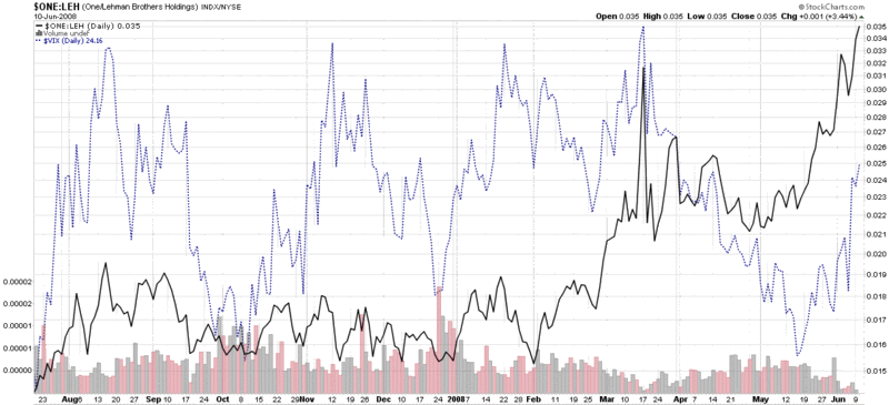
So what does a LEHVIX look like? Well…thanks to StockCharts.com, you can invert the LEH price chart and have the precipitous price drops look like spikes instead, as I have done in the chart below. Now compare the VIX (dotted blue) line with LEH (solid black line) and ask yourself which best represents the level of fear and anxiety you have experienced with respect to the markets. The VIX shows roughly equal levels of concern in August, November, January, and March. The LEHVIX (inverted LEH price history) shows a blip in August and January, but sheer panic in March and again in June. In this case, I think LEH has a better fix on fear and anxiety than the VIX. Of course, your mileage may vary…
I like the reverse LEH indicator, and that's why the ticker has gone to front and center on my real-time screen.
ReplyDeleteHowever, it's a bit of a stretch to point to any lack of 'inverted' spikes prior to January as some measure that this indicator is better than the VIX in measuring fear. Prior to January the market was either in the dark, or willfully ignorant, concerning the problems facing these IBs.