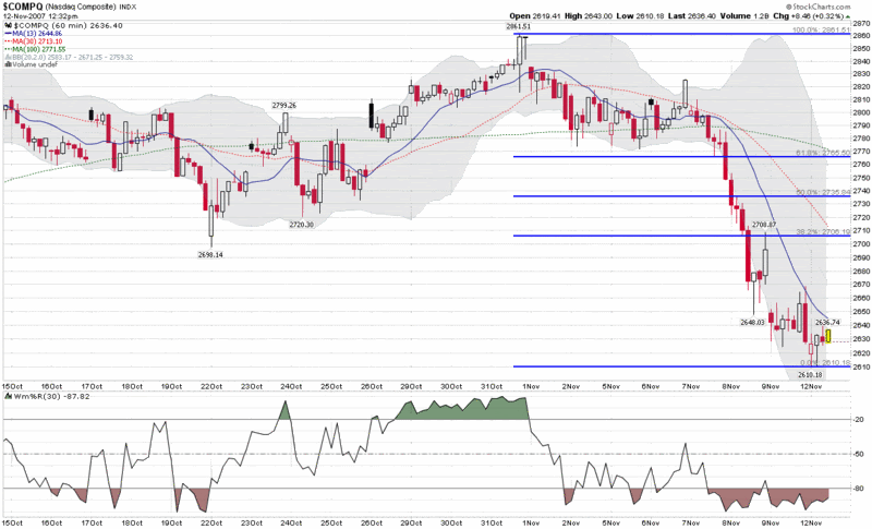
On Friday I posted a weekly chart of the NASDAQ going back six years. Today I am swapping the wide angle lens for a telephoto one and focusing on hourly bars for the past month. I am emphasizing the NASDAQ Composite (and the NDX) because that is where a good deal of the speculative activity has been as of late and where the correction was most severe last week.
The graph below shows four semi-arbitrary simple moving averages for the NASDAQ Composite Index: 13 bars; 20 bars (the faint dotted gray line in the middle of the Bollinger Bands); 30 bars (the same as the Williams %R time frame); and 100 bars. All this spans roughly a period of 1 ½ days to about 3 weeks. With the aforementioned Bollinger Bands and Williams %R data, as well as the Fibonacci retracement lines, there are many ways to keep score. As much as anything, however, I will be looking at the intensity and duration of the bull rallies off of the bottom. Given that many indicators point to the current situation as significantly oversold, the absence of a compelling bull rally may provide as much information as what is actually happening. In other words, a draw should favor the bears.
Finally, I still haven’t seen much in the way of fear yet…
0 comments:
Post a Comment