Wild weeks sometimes call for wild graphs. By the same token, what fun would it be to have a bunch of VIX data lying around if you didn’t have an opportunity to force it to play Twister at gunpoint from time to time?
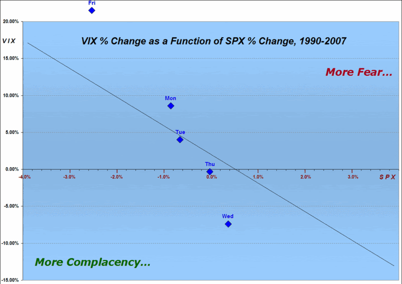
So…with those two thoughts placed firmly tongue in cheek, I set out to find yet another way to show just how fearful the markets were – or were not – this past week. This time around I have plotted a diagonal black line that represents a best fit of all VIX and SPX daily changes since 1990. Above and to the right of that line represents more fear per unit move in the SPX; below and to the left of that line represents more complacency per unit move in the SPX. The blue diamonds are the end of day plots for the changes in the VIX and SPX for last week
A look at the graph shows a notable lack of fear from Monday through Thursday, with Friday’s market selloff generating a spike in the VIX that was out of proportion to a typical VIX move for a -2.56% drop in the SPX. Going forward, I will keep track of how much time the SPX-VIX relationship spends on the fear side of the best fit line and the magnitude of that divergence. Today, for instance, we are back on the complacency side of the line with the Dow down 91 points and the SPX off 8.5 points.
For more information on the relationship between daily changes in the VIX and SPX, see my previous post, “SPX-VIX Daily Correlation.”
0 comments:
New comments are not allowed.