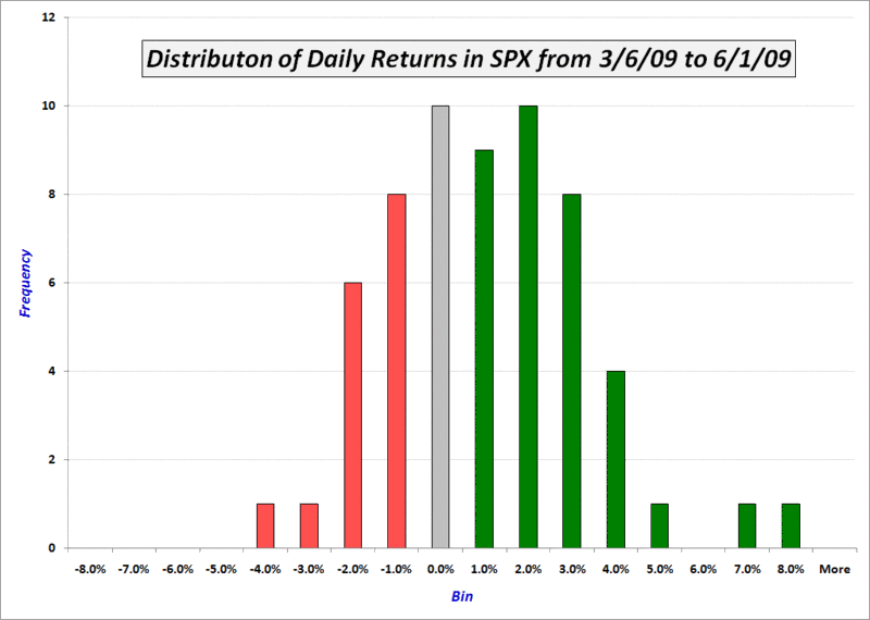
The graphic below is a histogram that reflects the frequency distribution of daily returns in the S&P 500 index (SPX) since the March bottom. I have shaded in gray the column that represents gains which have fallen in the -1% to +1% range. These are relatively neutral days. The preponderance of green reflects the fact that in the past three months, the relatively few down days have tended to be small drops. On the other hand, positive days have includes more small gains in the 1-2% range, many more larger gains in the 3-4% range, and a couple of exceptionally large gains of 7.08% and 6.37%.
Of course, a chart of weekly returns for the same period would show almost all green and two small patches of red…
Not sure how everyone else sees it, but for me 2009 has got to be the strangest market behavior year I've ever seen. Simply bizarre.
ReplyDelete