There are a wide variety of ways to measure market breadth, a number of which I have blogged about in the past in some detail. I have not, however, spent much time discussing new highs versus new lows in the S&P 500 index – and given that this blog spends an inordinate amount of time talking about the VIX, it makes sense that much of the analysis here eventually gets tied back in to the SPX.
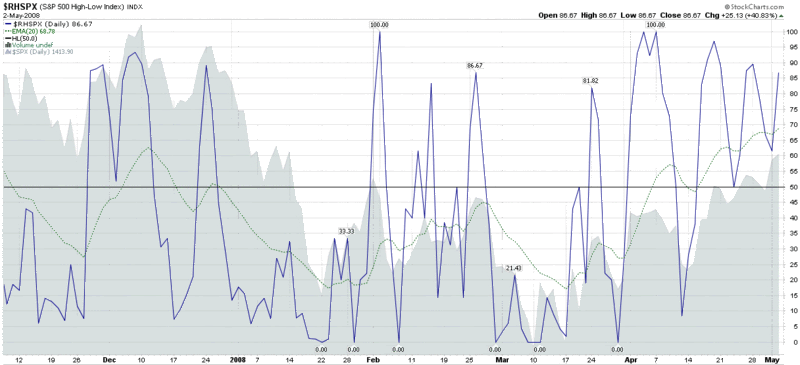
Of course there is a chart for this – and in this case I have elected to go back through six months of bearish market movement to make my points. The relative high and low chart is best used for two purposes: to identify oversold levels; and to help flag a change in trend. In the chart below, the 20 day EMA dips below the 20 level in both January and February of 2008 for the first time since October 2002, signaling an oversold condition. The change in trend is harder to spot on this chart, but historically a bullish leg is usually underway once the high low index is back over the 65-70 level. Note that the chart ends with Friday end of day data; this week will bring a better sense of the strength of the current rally.
0 comments:
Post a Comment