 There are several places on the web where you can watch a short time-lapse video that shows the recent history of the yield curve. One of those places is Fidelity’s Historical Yield Curve page.
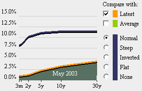
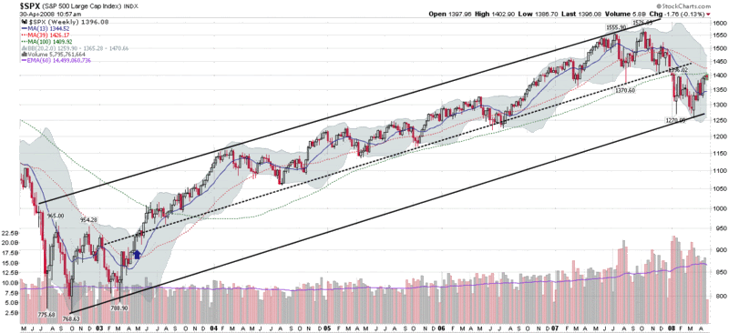
 In reviewing the history of the yield curve on the Fidelity site, I was surprised to see that the current yield curve is almost identical to the yield curve as it stood on May 2003. This may just be a historical coincidence, but May 2003 also represents the beginning of the five year bull market that followed the 2002-2003 bottom. In the graphic below, I have added a blue arrow to mark May 2003, which just happens to be the time that the SPX started making higher highs and confirming that a bullish move was underway.
Recall that the inverted yield curve which began in 2006 and caused considerable consternation among investors, turned out to be an excellent – if somewhat early – predictor of the coming stock market top and subsequent economic malaise. Historically a steep yield curve, such as the one we have at present and saw in May 2003, has generally been a harbinger of better times ahead and is often found at the beginning of economic expansions.
Not quite Bill.
ReplyDeleteDon't quit your day job!