Sunday, October 31, 2010

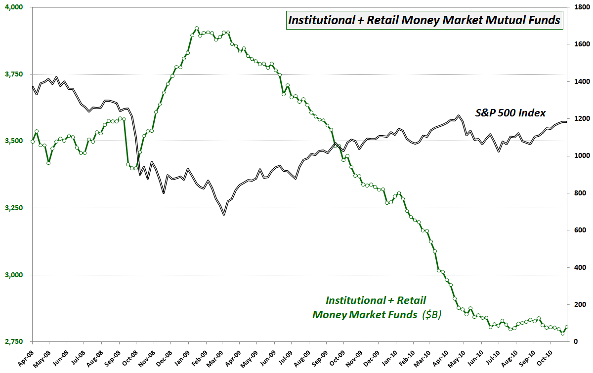
Chart of the Week: Money Market Mutual Funds

When the first version of this week’s chart of the week first appeared on the blog in Chart of the Week: Change of Trend in Cash Holdings? in January 2009, it generated a surprising amount of controversy. A follow-up post in March 2009, Cash on the Sidelines Headed Back to Stocks? also seemed to polarize some of the readership here.

In retrospect, this data from the Investment Company Institute (ICI) as well as similar data from AMG Data Services did an excellent job of keeping track of the flow of funds in and out of cash and therefore have been excellent proxies for a large part of the net change in demand for equities.

In the chart below, note that money market mutual fund assets began declining sharply in the second week in March 2009 (after topping in January 2009,) just as stocks were bottoming and starting to catch a bid. In the twenty months since the bottom in stocks, net changes to money market mutual funds have been a solid coincident and sometimes leading indicator of demand for stocks.

I am resurrecting this chart again for several reasons, not the least of which is that the decline in money market mutual funds has lessened considerably since the end of April, when stocks hit their 2010 highs. Additionally, last week’s increase of $25 billion in money market mutual funds was the largest since July 2009 and the second largest since January 2009. While this may not mean anything, I like to be provocative with these kinds of charts. Readers should at least be open to the possibility that most of the cash on the sidelines that will ultimately be committed to stocks in a bull market has already been committed. Perhaps it will take a significant downturn in bond prices for the next large pool of money to be moved into equities.

Either way, I still think this chart of money market mutual funds bears further watching.

Related posts:


[source: Investment Company Institute]

Disclosure(s): none

Friday, October 29, 2010

Transcript from Interview with Charles Kirk Now Available

The complete transcript of my interview yesterday afternoon with Charles Kirk of The Kirk Report is now available for viewing here. We covered a great deal of ground in an hour (for better or for worse, I can type faster than I can think) and our conversation and reader questions spanned topics such as:

  • my trading history prior to becoming a full-time trader in 2005
  • some of my best and worst trades (I forgot to answer the part about lessons learned, but I will flesh that out on the blog)
  • some of the factors that have contributed to my development as a trader
  • how I approach trading now
  • the role of volatility in my trading
  • the value of combining volatility and volume
  • some thoughts on how a beginning trader might want to make use of the VIX
  • the value of VXX as a portfolio hedge
  • what my proprietary market sentiment indicator (AMSI) is predicting right now
  • some of my favorite options resources
  • three “must read” posts on the blog, as well as my personal favorite
Thanks to all who participated. Some of the questions have given me ideas about subjects for future posts.

Finally, thanks to Charles Kirk for including me in his interview series. Charles is an invaluable trading resource for all of us, as well as an excellent interviewer.

Related posts:
Disclosure(s): short VXX at time of writing

Thursday, October 28, 2010

Charles Kirk to Interview Me Live at 5 PM ET Today

I am excited to announce that Charles Kirk of The Kirk Report will be conducting a live interview with me at 5:00 p.m. ET today for one hour.

The format of the interview is text-based and Charles typically includes a healthy dose of questions from the audience, so I encourage anyone who is interested to join us at this link – and bring along some questions in your back pocket.

Since I live only about five miles by kayak from AT&T Park, I am acutely aware of tonight’s World Series game, but I have it on good authority that our interview will not run into extra innings and put fans in some sort of Heidi Game dilemma.

So bring your questions and I will bring the lumber, dig in, and be sure not to take any pitches, no matter how far out of the strike zone they may be…

Related posts:

Disclosure(s): none

More Upticks in Economic Data vs. Expectations

Today was the first week since the end of August that both the initial claims and continuing claims for unemployment were lower than consensus expectations.

While one week of noisy data should not substantially embolden the bulls, there has been a noticeable uptick in positive reports since the beginning of September – one that just so happens to coincide with the upturn in stocks.

I last updated the chart below at the beginning of the month and since that time, the pattern of positive surprises has continued. Note that housing and construction continue to provide the most consistent positive surprises, while the consumer appears to have a turned a corner at the end of August, giving a boost to stocks.

If the data are painting any sort of discernable picture, from my perspective the canvas looks like a story of slow but steady improvement – and more slow than steady at this stage.

Related posts:


Disclosure(s): none

Wednesday, October 27, 2010

Changes and Q3 Updates to the Newsletter and EVALS

It has always been my intent to keep the subscriber newsletter and EVALS (ETF Volatility Analysis Long/Short trading system) as a distant sideshow to the center stage occupied by the blog. That being said, potential subscribers have asked for at least quarterly updates which explain what it going on in the newsletter, discuss the Stock of the Week (SOTW) and talk a little about the performance of the model portfolios and other issues of interest.

Yesterday I posted third quarter updates and commentary on both the subscriber newsletter and EVALS blogs as follows:

For those seeking additional information, I am offering a 14-day free trial to the subscriber newsletter for all new subscribers. At this time, there are no free trial offers associated with EVALS.
Related posts:
Disclosure(s): none

Monday, October 25, 2010

VIX and VXX: In the Beginning…

Last week in What Do You Want to Know About VXX? I asked readers for their thoughts on what to cover in what I anticipated would be a big kitchen sink post about the iPath S&P 500 VIX Short-Term Futures ETN (VXX.)

After reflecting upon the many thoughtful emails and comments I received, I realized that the scope of interest in and confusion about this product is sufficient to warrant a multi-part series. The more I thought about the broad spectrum of knowledge and lack of knowledge pertaining to VXX, the more I realized that it makes sense to start at the beginning to give investors of all experience levels as well as recent additions to the blog readership an opportunity to approach the subject with the same foundation of knowledge and context.

So…for the first time since launching this blog four years ago, I will start with the most basic question of all: what is the VIX?

The VIX, whose formal name is the CBOE Volatility Index, is a calculation made by the CBOE of market expectations of 30-day implied volatility for S&P 500 index options. The CBOE calculates and disseminates VIX values every 15 seconds during the index trading day, which runs from 9:30 a.m. to 4:15 p.m. Eastern Time. In other words, the VIX is calculated during the normal NYSE trading day, plus 15 minutes after the close of normal trading.

With any luck, the graphic I created below simplifies the explanation of how the VIX is calculated.

The intent of the graphic is to demonstrate that out of the universe of all traded stocks, the VIX is concerned only with the stocks which comprise the S&P 500 index, also known by its ticker symbol, SPX. The S&P 500 index is maintained by an index committee (more details here), with periodic changes to the index constituents. The VIX is calculated using near term SPX options (typically the first two months) and a wide range of strikes (see the CBOE’s VIX white paper for details on the calculation methodology) and essentially reflects the implied volatility of those options used in the calculations.

The result is the market’s estimate of implied volatility for the S&P 500 index for the next 30 days, stated in annualized terms. See Rule of 16 and VIX of 40 for a better sense of how standard deviations are factored into the VIX and how to interpret the VIX in terms of standard deviations.

In the next installment, I will make the jump from the VIX to VXX, but in order to do so, we will have to become familiar with VIX futures as well.

For those who are interested in some additional reading, the links below are an excellent place to start, as are all the VIX and More posts tagged with the “educational” label.

Related posts:


Disclosure(s): short VXX at time of writing

Sunday, October 24, 2010

Chart of the Week: Intrade and the Midterm Elections

Three months ago in Chart of the Week: Intrade and Control of the House of Representatives, I used an Intrade.com contract as the chart of the week to illustrate how the markets were assigning probabilities to whether the Republicans would control the House of Representatives following the upcoming November 2nd election. At the time, that contract had last traded for 55.1, which roughly translates to a 55.1% probability of Republican control.

Just two weeks and two days before voters go to the polls, that same contract is trading at 90, meaning that the markets are about 90% sure that Republicans will control the House following the election. Among the more critical questions at this juncture are how many seats the Democrats will retain in the Senate and just how many seats the Republicans will gain in the House. The contracts covering the House gains are issued in increments of five seat strikes, so that there are separate contracts for a gain of 50 or more seats, 55 or more, 60 or more, etc. Right now the most active trading can be found in the at-the-money contracts, with the +55 seat contract last quoted at 57.9 bid and 61.8 ask, while the +60 seat contract last quoted at 38.1 bid and 43.8 ask.

The chart below, courtesy of Intrade, tracks the trading in the +55 seat contract for the past 90 days. Note that this contract crossed the 50 threshold one week ago today and last traded at 61. Looking at the various contracts, prior to the contracts, the highest seat count that was trading over 50 was +45 seats. During the second week in October, both the +50 and the +55 seat contracts rose above the 50 level. With the recent heavy betting on the +60 seat contract and its doubling in price over the course of the last month, it looks as if this is the contract to watch to see how the far the balance of power appears to be tipping in the direction of the Republicans.

As I noted the last time around, for those who are interested in a seat-by-seat, poll-by-poll perspective on the election, RealClearPolitics.com is a great place to start. Those like me who are more interested in assigning probabilities to the overall outcome may prefer to keep an eye on Intrade.com, the popular prediction market site.

Finally, it is probably stating the obvious, but don’t be surprised to discover that there is a relationship between the projected Republican seat gains and the stock market.
Related posts:


[source: Intrade.com]

Disclosure(s): none

Friday, October 22, 2010

Appearance on The Option Block

Yesterday I made a guest appearance on The Option Block, an Options Insider Radio program hosted by Mark Longo of The Options Insider. We talk a little bit about the history of the VIX and More blog, the VIX as a market timing indicator, the VIX as a hedging tool, VIX options, VIX futures, VXX, VXZ and some related subjects.

My interview comes at the beginning of the show, but I can heartily recommend the entire program, which delves into subjects such as currency options and some interesting options order flow in the likes of SKS, RSH, HRB, MOT, etc. and involves a top-notch panel of options experts:

Related posts:
Disclosure(s): none

Thursday, October 21, 2010

VXX Monthly Performance

Yesterday I asked for some input in What Do You Want to Know About VXX? and was pleased to see all the comments and emails. Reflecting on the situation, since I have received literally hundreds of questions about VXX in the last month or two, I have elected to go ahead with a multi-part series on VXX starting next Monday, rather than trying another “Ten Things Everyone Should Know…” post like I did with Ten Things Everyone Should Know About the VIX. Frankly, limiting myself to just ten facts/issues/misconceptions could not possibly do VXX justice and this time around I will do a much deeper dive than I did with the VIX.

That being said, I feel obliged to give readers something to chew on before this week is over and have therefore attached a chart of the monthly performance of VXX going back to the launch of this ETN. The chart lays out the VXX conundrum in monthly terms, but the issue is similar across all time frames: do you want to take a long position which has a low probability of success, but a high potential reward? Of course, the longer the holding period, the more contango will lower the probability of success, but the better chance there will be that an investor will catch a big spike in volatility, like we had in May.

In some respects, a long VXX position resembles a long out-of-the money option position.

Once again, if you have a specific question about VXX, feel free to add it to the comments section in the first link below and I’ll see if I can work it into next week’s series.

Related posts:


[source: ETFreplay.com]

Disclosure(s): short VXX at time of writing

Tuesday, October 19, 2010

What Do You Want to Know About VXX?

Lately I have been bombarded with questions about VXX and before the week is over I will have some kind of comprehensive post on VXX along the lines of Ten Things Everyone Should Know About the VIX -- which is the all-time most read post on this blog.

So...if there is something you are particularly interested in knowing about when it comes to that most beguiling of ETNs, just mention it in the comments section below and I will do my best to work it in.

Monday, October 18, 2010

Expiring Monthly October 2010 Issue Recap

Just a quick reminder that the October issue of Expiring Monthly: The Option Traders Journal was published today and is available for subscribers to download.

This month I authored two pieces that I think readers might find particularly interesting. The first is the monthly feature, Fear and Loathing in October, which examines seasonality from an anecdotal, statistical and a behavioral finance perspective and puts the September through January period under the analytical microscope. Also of interest is the third and final installment in my series on the VIX futures term structure. VIX Futures: Putting Ideas into Action takes a six-part framework for analyzing VIX futures and discusses some of the implications for trading VIX options and VIX ETNs such as VXX.

I have reproduced a copy of the Table of Contents for the October issue below for those who may be interested in learning more about the magazine. Subscription information and additional details about the magazine are available at http://www.expiringmonthly.com/.

Related posts:


[source: Expiring Monthly]

Disclosure(s): I am one of the founders and owners of Expiring Monthly

Sunday, October 17, 2010

Chart of the Week: The Google Volatility Story

If there is one widely accepted tenet of volatility that my wife refuses to give in to, it is that when a stock falls sharply its implied volatility almost automatically increases, yet when that same stock jumps sharply, its implied volatility almost automatically decreases. Volatility should be directionally agnostic, she insists, whether it is implied volatility or historical volatility.

In the case of stocks, a balanced bi-directional view of volatility rarely prevails. The main reasons for asymmetric volatility expectations have to do with the beliefs that are associated with extreme price movements. The old aphorism, “Stocks take the stairs up, but the elevator down” has some statistical support and for most traders, considerable confirmation in terms of personal experience. Said another way, when something positive happens to a company, it rarely creates a virtuous cycle that lifts its stock price skyward. On the other hand, when things go bad, the dominoes have a habit of lining up in such a way as to create a vicious cycle of bad news, which some investors have dubbed the “cockroach theory” due to the fact that there never seems to be just one cockroach.

Partly as a result of elevators, cockroaches and personal experience, most equity options demonstrate a negative volatility skew (also known as a reverse skew or “volatility smirk”) in which out of the money puts have substantially higher implied volatility than out of the money calls.

This week’s chart of the week shows the curious phenomenon that my wife takes issue with. Specifically, Google’s (GOOG) stock price jumped 11% on Friday following a very strong earnings report. As the chart below shows, historical or realized volatility jumped dramatically (20-day historical volatility almost doubled from 21 to 41,) while implied volatility fell sharply (30-day implied volatility dropped from 30.24 to 25.35.)

With Google’s earnings out of the way, clearly some event volatility was removed from the stock’s immediate outlook, but did Friday’s 60 point jump in the stock prices really make it less susceptible to future volatility. That is what the data would have us believe…

Related posts:


[source: Livevol Pro]

Disclosure(s): Livevol is an advertiser on VIX and More

Thursday, October 14, 2010

The Case for VQT

Many investors, present company included, are sitting on sizeable gains from long positions going back as far as March 2009. With the S&P 500 up 16% from its recent July 1st low of 1010 and looking like it may take another run at 1200 sometime soon, longs are torn between the desire to lock in some profits on the one hand and have the potential to benefit from further upside on the other hand.

While there are a number of ways to approach this problem, a new off-the-shelf strategy became available with the launch of Barclays ETN+ S&P VEQTOR ETN (VQT) on September 1st.

To briefly recap, VQT is essentially a portfolio with two components: a long SPY component and a long VXX component. At the end of each day, the ETN evaluates volatility risk and based upon rules which incorporate realized volatility and implied volatility, determines how much the SPY positions should be hedged with VXX. The result is a dynamically hedged long position that is hedged with volatility. The SPY component of VQT is set to vary in a range of 60-97.5%, with the VXX component comprising the balance of the VQT at anywhere from 2.5-40%.  VQT also has another intriguing portfolio allocation feature that none of the other volatility ETNs have:  a stop loss provision which overrides all other allocations.  This stop loss provision is triggered whenever VQTs 5-day return falls below -2%, at which point the ETN's portfolio automatically switches to 100% cash and remains at 100% cash until the 5-day return rises above -2%.

The chart below shows that VQT is structured not only to limit losses in an environment of increased volatility, but also profit in some high volatility scenarios.

Since VQT is perhaps the most complex actively managed ETN that is traded, I highly recommend that readers study the pricing supplement for VQT, the highlights of which I sketched out in Barclays VEQTOR ETN (VQT) Begins Trading.

Finally, I feel obliged to mention that to date VQT has only managed to trade about 5,000 shares per day, on average. While market depth is not great, the spread is consistently in the area of about 0.06 – which is not bad considering that VQT is trading over 105 as I type this. As is the case with any exotic ETN, there is no guarantee VQT will attract sufficient interest to become a permanent fixture on the investing landscape, which would be a shame, because I believe this ETN has considerable potential.

For those who think they might have an interest in this product further on down the line, I have one thought: use it or lose it!

Related posts:

 
[source: Barclays]
 
Disclosure(s): long VQT and short VXX at time of writing

Wednesday, October 13, 2010

Capitulation in Back Month VIX Futures

Yesterday, in VIX Sets Two New Records, I suggested that it was coming, but I never expected it to happen in such dramatic fashion.

In what I believe is an unprecedented move, the VIX futures collapsed today without any movement in the front month VIX futures.

For those who are fixated on the cash VIX and the first two months of VIX futures, the movement in the November through May VIX futures chronicled below probably looks unremarkable, as proportional as it is, but that is exactly the point: the VIX term structure almost never moves in uniform proportions. Typically the front month moves the most, the second month may move half as month as the front month, the third month half as much as the second month and so on. See the links at the bottom for some examples.

Today the cash VIX gained 0.14 points (to close at 19.07) and the front month VIX futures held steady at 20.65, indicating that market participants see the likely October settlement for the VIX one week from tomorrow at about 1.58 points above the current level.

The really interesting part is that at the same time the consensus of opinion is calling for a short-term rise in the VIX, there was an almost audible sigh of, “Oops, we have this one wrong…” when it comes to the longer-term outlook for the VIX.

Yesterday I thought I was going out on a limb when I repeated what has been a consistent position for the last few months:

“I do believe that when estimates of near-term and long-term volatility show a record degree of divergence, some considerable opportunities are presented. As I have spelled out in a number of instances lately, my thinking has been that the back month volatility will likely collapse in order to bring the present and the future back into line. There has been some evidence of that happening during the past two days, but I anticipate that long-term volatility expectations will continue to decline.”
Today it looks as if I picked up quite a few converts. Now the question becomes one of how low the distant month volatility in the VIX futures will fall. Back in April it went as low as the 23s. Today the distant month VIX futures dipped below the 30 level for the first time since June. The May 2011 futures are already down 2.85 points (8.7%) this month and if they are to match April’s levels, there are still another 6 points left to fall.

When back month VIX futures move more than front month futures, I pay attention. Perhaps I should have more company…

Related posts:

Disclosure(s): neutral position in VIX via options at time of writing

Tuesday, October 12, 2010

VIX Sets Two New Records

It is not every day that the VIX establishes some sort of new all-time record and it is rarer still that the volatility index sets two different records on consecutive days, but such has been the case at the beginning of this week.

The first record, established on Monday, was in the VIX:VXV ratio – a subject that I covered on a regular basis in the first year or so following the launch of VXV, which is essentially a 93 day version of the VIX and whose formal name is the CBOE S&P 500 3-Month Volatility Index.

Long-time readers will recall that for the first year after VXV was launched, the VIX:VXV ratio performed flawlessly (see VXV Is One Year Old.) In a post-Lehman world, however, the VIX:VXV ratio has been inconsistent as the persistent extreme contango has made the ratio more difficult to calibrate. I have been doing some work on this, however, and will share some of my thinking about how to tweak this ratio going forward.

The latest record, established today, is in my proprietary VIX Futures Contango Index. I spelled out some of my thinking about the epic disconnect between the cash/spot VIX and the VIX futures in a post a month ago with the title of VIX Futures: What Are/Were They Thinking?

In the end, the VIX:VXV ratio and the VIX Futures Contango Index both measure different aspects of the same phenomenon: how much current volatility readings vary from future market volatility estimates. I do believe that when estimates of near-term and long-term volatility show a record degree of divergence, some considerable opportunities are presented. As I have spelled out in a number of instances lately, my thinking has been that the back month volatility will likely collapse in order to bring the present and the future back into line. There has been some evidence of that happening during the past two days, but I anticipate that long-term volatility expectations will continue to decline.

On a related note, VXX has made a new all-time low six days in a row and counting...

Related posts:


[source: StockCharts.com]

Disclosure(s): neutral position in VIX via options at time of writing

Sunday, October 10, 2010

Chart of the Week: The Dollar and the SPX Since August 2008

If you have been using the dollar as one of your primary indicators, chances are it has been a good year or perhaps even a good several years.

Stocks and the dollar do not always move in opposite directions, but for the better part of the last two years or so they have been doing just that, as the chart of the week below shows.

Note that the recent rise in stocks since the beginning of September has coincided with a declining dollar that has lost value in 15 of the last 18 weeks.

A weaker dollar has a number of influences on stocks, but the most notable is that it makes products and services cheaper in foreign markets. Some sectors benefit more than others. Heavy equipment and materials companies are beneficiaries of a weaker dollar, as is manufacturing in general. Technology is also a sector that is heavily dependent upon exports.

For now at least, the dollar is one of the strongest factors acting on stocks and commodities.

Related posts:


[source: StockCharts.com]

Disclosure(s): none

Friday, October 8, 2010

Robert Engle’s FT Lectures on Volatility

I am still not sure why Brenda Jubin’s Reading the Markets, remains criminally undiscovered, but for those who do not make visiting that blog a daily habit, I feel it my duty to draw attention to some of the excellent work she has been doing lately.

As far as I can tell, Brenda spends part of her free time reading every book ever written about investing and various tangential subjects. Even if this is only a slight exaggeration, her comprehensive review of the investment literature forms a sort of contemporaneous intellectual history of the markets – and for this reason makes it onto my daily reading list.

From time to time, the narrative at Reading the Markets veers in the direction of options and volatility. A particularly valuable contribution has been Brenda’s posting of her notes and graphics on a five-part lecture series given by Robert Engle in July 2007. One post is devoted to each lecture, with the links to her posts below:

Reading the Markets – Notes and Graphics:

Part of the motivation for posting the notes and the graphics is that while the FT Business School – NYU Stern School of Business splash page has captured the links to transcripts of each of the five addresses, the video links on that page are not functional.

With a little sleuthing, however, I was able to find the video links to each of the five lectures and below I have captured the video and transcript in what I hope is a more useful format:

FT Business School – NYU Stern School (original content):
For anyone seeking the key takeaways from this series, I would jump right to Brenda’s comments and graphics. For all the details, the FT-Stern content above is the place to go.

Also worth checking out is the NYU Stern Volatility Institute and its Volatility Laboratory.

Related posts:

Disclosure(s): none

Thursday, October 7, 2010

The REZ Paradox

I had a brief exchange with Andrew Butter on Seeking Alpha that I thought might warrant a broader audience here.

Specifically, Andrew asked about the FTSE NAREIT Residential Plus Capped Index Fund (REZ) and wondered if apartments were behind the relative outperformance of this real estate ETF.
My reply noted that the three largest components of REZ are:

  1. Apartments – 47%
  2. Health care – 37%
  3. Self storage – 13%
It comes as no surprise to anyone that recent economic forces have driven a number of strong housing market trends, including a decrease in home ownership and an increase in the demand for apartments. A story by Dawn Wotapka of the Wall Street Journal yesterday confirmed that the apartment market continues to rally.

Of course, as homeowners migrate to apartments, they are typically downsizing in terms of square feet of living space, which is also increasing the demand for self-storage facilities. When you add together the 47% of REZ that is accounted for by apartments and 13% that is attributed to self storage, the result of the move from homes to apartments is a paradox of sorts in which the REZ ETF as currently structured should perform particularly well in a deteriorating residential real estate market.

Seen in this light, there is little wonder that REZ has outperformed its counterparts, RTL and FIO, which are focused primarily on shopping centers and offices, respectively.

Finally, on a housekeeping note, I am making a concerted effort to keep up with my Seeking Alpha private mailbox and comments, just as I do with private emails and comments on the blog. At the moment I am a little behind, but if you have some outstanding questions and comments, I expect to get caught up in the next day or two.

Related posts:

Disclosure(s): none

Wednesday, October 6, 2010

Commercial Real Estate Sub-Sector Breakout

Back in April 2009 in Commercial Real Estate Sub-Sectors ETF to Watch, I highlighted three commercial real estate sub-sector REIT ETFs, discussed their composition and included a performance graph going back to the date of the Lehman Brothers bankruptcy, September 15, 2008. The three REIT ETFs are:

  • FTSE NAREIT Retail Capped Index Fund (RTL) – emphasis on shopping centers (46%) and regional malls (43%)
  • FTSE NAREIT Industrial/Office Capped Index Fund (FIO) – mostly office (66%), but some (21%) industrial
  • FTSE NAREIT Residential Plus Capped Index Fund (REZ) – apartments (47%) dominate, but with a healthy dose (37%) of health care
I have updated the performance of each of these real estate sectors in the chart below, which reflects all dividends and also begins from the date of the Lehman Brothers bankruptcy filing. This time around, instead of updating the StockCharts.com graphic, I have elected to use an ETFreplay.com chart, as it adds some numbers to the chart, notably total return statistics as well as historical volatility and drawdown data.

Note that the residential real estate ETF, REZ, has rallied to where it is currently trading 8.1% above its pre-Lehman level and comfortably above the April 2010 high. On the other hand, the highly correlated industrial/office real estate ETF (FIO) and retail real estate ETF (RTL) are still both more than 15% below their pre-Lehman levels and are struggling to move above their April 2010 highs.

Real estate is a multi-dimensional beast and these three sub-sector ETFs can assist investors in understanding which parts of the real estate market are showing relative strength and which are demonstrating relative weakness.

Related posts:

[source: ETFreplay.com]

Disclosure(s): none

Tuesday, October 5, 2010

Updating the Commercial Real Estate Picture

I am amazed by how many people land on this blog via Google and other search engines in the process of looking for answers to various questions about commercial real estate. I find this interesting in that I have only tagged six posts with the CRE label (the links at the bottom of this post) and none in the past 17 months. Obviously there are a lot of people with questions and very little in the way of answers.

One of the CRE subjects I touched upon in April 2009 was the Moodys/REAL Commercial Property Price Index. According to the MIT Center for Real Estate, the CPPI “is designed to track same-property realized round-trip price changes based purely on the documented prices in completed, contemporary property transactions. The index uses no appraisal valuations.” There are actually a number of indices and sub-indices in the CPPI. I have reproduced the monthly national index below, which aggregates data from each of the four major property type sectors (office, apartment, industrial and retail) across a broad cross-section of metropolitan areas. Sub-indices track trends in different sectors and in different geographies.

Note that in the national index graph below, the bounce in the index from earlier in the year has been reversing since April. Looking at the sectors (not shown), the only area of continued strength in the commercial real estate market has been apartments. The office sector is rebounding weakly, the industrial sector appears to be wavering and the retail sector continues to decline sharply.

Going forward, I intend to feature more posts on the commercial real estate market.

For those looking for a more regular flow of content from industry insiders, check out a list I compiled last year of my favorite Commercial Real Estate Blogs.

Related posts:


[source: MIT Center for Real Estate, Real Capital Analytics]

Disclosure(s): none

Sunday, October 3, 2010

Chart of the Week: Visualizing the Flash Crash

This week the allied forces of the SEC and CFTC released their joint report on the ‘flash crash’ with the title of Findings Regarding the Market Events of May 6, 2010.

While many were underwhelmed by the report, it provides traders with a sense of some of what happened during a day in which the Dow Jones Industrial Average fluctuated some 1138 points.

The chart of the week below shows what happened to IWM, the highly liquid ETF for the Russell 2000 index. IWM trades more than 60 million shares per day and is regularly one of the most active issues traded. Up until 2:43 p.m. ET, IWM was acting normally. Then as the price (dashed line, right scale) began to accelerate downward, liquidity (green and blue bands, left scale) suddenly began to dry up. By 2:46 p.m., market depth (the height of the green and blue bands) in IWM had almost completely disappeared. Over the course of the 74 minutes left in the normal trading session, liquidity began to return slowly to the markets. At the time the markets closed, approximately 60% of the normal market depth from earlier in the day had returned to IWM.

The report linked above has some interesting graphics surrounding trading in ACN, PG, MMM, IBM, AAPL, GE and IWM beginning on page 91 of the PDF. If anything, the action in IWM is the least extreme of the group.

If you have some time, the report is worth at least a scan.

Related posts:


[source: SEC and CFTC]

Disclosure(s): none

Friday, October 1, 2010

Economic Data Trends Improving

Those who were looking for some sort of unambiguously bullish number from this morning’s ISM manufacturing survey may have been disappointed, but as the chart below shows, economic data relative to expectations have taken on a much more bullish tone since the end of August.  There was some evidence of a positive trend in the data when I last posted this chart on September 13th in Chart of the Week: Updated Economic Trend Data. At that time, however, the trend was a weak one, leading me to conclude:

"While there is some evidence that the downtrend in economic data may have been broken, there is at best marginal evidence to support the idea of a bullish uptrend in the data."
Since that time, there has been a notable uptick in the data – at least relative to consensus estimates – in manufacturing, housing/construction and in the consumer sector.

Of course until the increase in economic activity is reflected in the nonfarm payrolls reports next Friday or in subsequent months, any sort of ‘improvement’ is going to look more like treading water than genuine progress.

Also of note: next Friday is the final nonfarm payrolls report before the mid-term elections.

Related posts:


Disclosure(s): none

DISCLAIMER: "VIX®" is a trademark of Chicago Board Options Exchange, Incorporated. Chicago Board Options Exchange, Incorporated is not affiliated with this website or this website's owner's or operators. CBOE assumes no responsibility for the accuracy or completeness or any other aspect of any content posted on this website by its operator or any third party. All content on this site is provided for informational and entertainment purposes only and is not intended as advice to buy or sell any securities. Stocks are difficult to trade; options are even harder. When it comes to VIX derivatives, don't fall into the trap of thinking that just because you can ride a horse, you can ride an alligator. Please do your own homework and accept full responsibility for any investment decisions you make. No content on this site can be used for commercial purposes without the prior written permission of the author. Copyright © 2007-2023 Bill Luby. All rights reserved.
 
Web Analytics