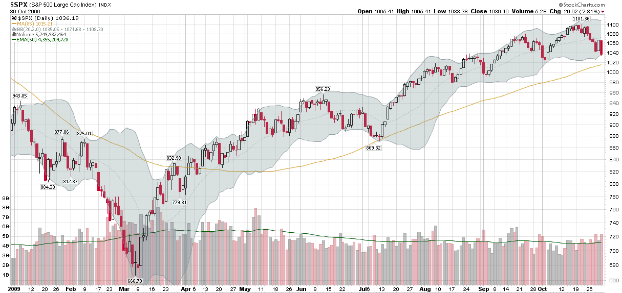
Frontier ETFs
In yesterday’s chart of the week, I looked at three ETFs with exposure to the Middle East:
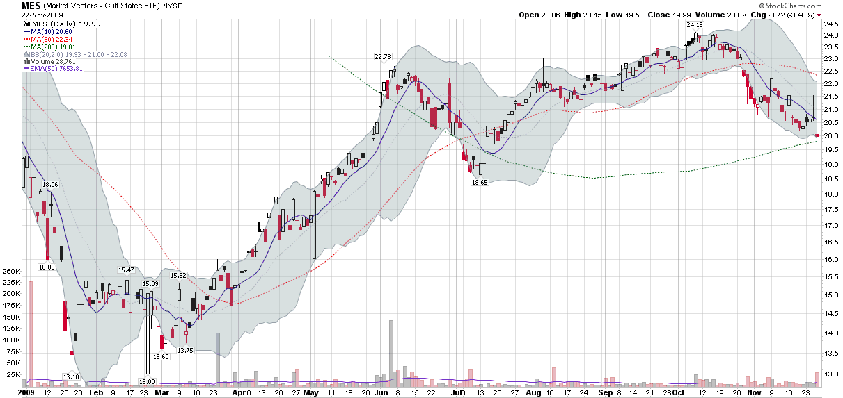
- Market Vectors Gulf States ETF (MES)
- Wisdom Tree Middle East Dividend ETF (GULF)
- SPDR S&P Emerging Middle East and Africa ETF (GAF)
It is a little known fact that Middle Eastern ETFs are actually subset of a relatively new class of ETFs called frontier ETFs. Many of these frontier ETFs are single country ETFs, but two in particular stand out as diversified frontier plays:
- PowerShares MENA Frontier Countries Portfolio ETF (PMNA)
- Claymore/BNY Mellon Frontier Markets ETF (FRN)
I list PMNA (holdings) first because it is not a global, but a regional ETF, based on the NASDAQ OMX Middle East North Africa Index. At present the fund has a strong emphasis on the Persian Gulf and should be considered as a slightly more liquid (but still relatively illiquid) alternative to MES and GAF, trading approximately 10,000 shares per day. As of last week, the top country allocations were in the United Arab Emirates (22.6%), Egypt (20.2%) and Kuwait (16.9%).
In contrast to PMNA, FRN (holdings) has taken a much broader and more geographically diversified global approach, without a particular regional emphasis. Specifically, the ETF is designed to track the Bank of New York Mellon New Frontier DR Index. As of September 30, the top country allocations were Chile (28.6%), Poland (15.9%) and Egypt (15.4%).
The chart below shows that the while PMNA and FRN were very similar in terms of performance for the first five months of 2009, the more diversified FRN had been a much stronger performer during the latter half of the year. Not surprisingly, given PMNA's exposure to the Persian Gulf, the gap has widened significantly during the last few days.
In addition to these multi-country frontier ETFs and regional frontier ETFs such as Market Vectors Africa (AFK), it is important to keep in mind that there are many single country ETFs available, with an increasing amount of geographical diversity. Just last week, the first Poland ETF (PLND) was launched. For investors who are interested in single country Middle Eastern ETFs, Van Eck is planning to launch new ETFs for Egypt and Kuwait.
Finally, consider that frontier ETFs are likely to appeal only to investors who can tolerate high levels of risk. The multi-country and single country variants suffer from low liquidity and high volatility, making it unwise to build up large positions until trading volumes increase dramatically from current levels.
[source: StockCharts.com]
Disclosure: none
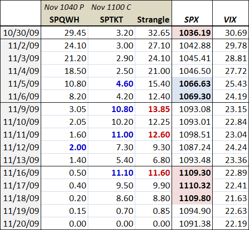
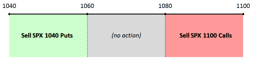
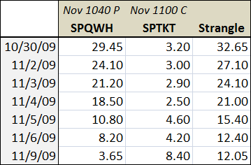 The table to the right shows the closing values for the 1040 put (SPQWH) and 1100 call (SPTKT) since I originally mentioned the strangle (the values for today are the midpoints between the bid and ask as of 1:00 p.m. ET.) The table shows that the both the bounce in the SPX (from 1043 to 1086) and the substantial drop in the VIX (from about 28 to 23) have significantly eroded the value of the 1040 put. Interestingly, the increase in value in the 1100 call is nowhere near as dramatic as the movement of the puts, as