Sunday, November 30, 2008

VIX and More: The Month in Words

Anyone who has yet to experiment with Wordle is missing out. First brought to my attention by Barry Ritholtz at The Big Picture, Wordle is a site that lets users turn text into a word cloud, with a wide array of creative options.

Wordle can be used purely for fun, for analysis, or for any number of purposes. It might also have some value as an archival tool too.

Without further ado, here is a Wordle word cloud for all of the VIX and More posts from November 2008:

[source: Wordle, VIX and More]

Saturday, November 29, 2008

Chart of the Week: Yields on U.S. 10-Year Treasury Notes Below 3%

The chart of the week looks like it will now be a regular feature in this space. This week’s theme, once again, has a bond focus and extends the flight to safety theme from last week. The graphic below captures the full 46 year history of the yield on the 10-Year U.S. Treasury Note. While difficult to discern from the graph, this is the first week the yield on that bond has ever closed below 3.0%. The reason for the low yield is the overwhelming demand cause by investors who are embracing a flight to safety approach to investing and see U.S. government debt as a safe haven for their assets.

The low yields on U.S. government debt have several interesting implications. One implication is that a falling VIX does not reflect the action in the government bond markets. Another implication is that rising yields will indicate when money is starting to flow out of safe haven investments toward higher risk investments such as stocks. Finally, when the bulk of those currently holding government debt decide that it is appropriate to redeploy these assets into stocks, the pent-up demand for equities will be a formidable factor to reckon with.


[source: VIX and More]

Friday, November 28, 2008

Recent Highlights in Volatility

I am moving closer and closer to a regular feature along the lines of “The Week in Volatility.” I’m not quite there yet, so today I am going to turn the keyboard over to others around the blogosphere who have posted some interesting articles of note about volatility from the past week:

Thursday, November 27, 2008

Happy Thanksgiving to All

When you are done with all the turkey, stuffing and pumpkin pie, consider some exercise.

The chart below, courtesy of the Mayo Clinic, spells out how much exercise it will take to burn off the gastronomic excesses of the day:

[source: Mayo Clinic]

Wednesday, November 26, 2008

ProShares Rolls Out Commodity and Currency 2x and -2x ETFs

Just 12 days ago I came out with what I thought was a bold statement in Prediction: Direxion Triple ETFs Will Revolutionize Day Trading. I was going to do a follow-up to show how volume has skyrocketed in these ETFs, but Bespoke beat me to it in today’s 3x ETFs on Fire. Bespoke includes some excellent graphics that capture the extreme volatility in these ETFs as well as the snowballing volume trend.

Not to be outdone by Direxion, ProShares is now rushing to market a new group of 2x and -2x ETFs focused on commodities and currencies.

Personally, I continue to transition more and more of my trading from stocks to ETFs. I think the ETF trend is here to stay.

[source: ProShares]

Recent Gold Volatility

I have been receiving quite a few questions about gold and gold volatility lately, so with gold receiving a lot of attention in the press, I thought this would be a good time to check in on the commodity and on the CBOE’s gold volatility index (GVZ), which was launched back in August.

Gold is something every investor should be watching these days as it reflects the ebb and flow of opinions about the risk of deflation in the short run and inflation over the longer run.

In the chart below, I have captured the price action in the commodity as tracked by GLD, the popular gold bullion ETF. I have also included the GVZ (aka “Gold VIX”) to gauge some of the recent volatility in gold trading. Gold volatility peaked back on October 10th and has been in a gradual downtrend for the past six weeks. The chart reflects that spikes in gold volatility have generally coincided with spikes in the price of the commodity.

The broader issue of correlations between gold prices and volatility is much more complicated and subject to cyclical swings. In the chart I have highlighted two periods in which gold and gold volatility have shown a persistent negative correlation, first in August and later in mid-October. These two instances were both bearish for gold prices, yet when the correlation switched back to a positive one, gold prices began to move up in both instances.

It is still too early to draw any definitive conclusions between gold prices and gold volatility, but I will return to this subject periodically as my thinking evolves on the subject.

[source: VIX and More]

Tuesday, November 25, 2008

A. Schulman Confounds the Imagination

Kudos to Michelle Leder at footnoted.org for some excellent spadework involving yesterday’s proxy filing for plastics company A. Schulman (SHLM). In “Gone Fishing – Seriously…” Leder flagged the section I have highlighted below in bold italics, but I thought it might be even more interesting to put the outlandish excerpt in the context of the broader scope of original document. The quotation is lifted from page 26 from a section with the title “Perquisites and Personal Benefits.”

“In April of 2008, the Compensation Committee eliminated most perquisites and personal benefits that previously had been extended to our North American Named Executive Officers, such as providing automobiles and related costs, and increased their base salaries as compensation for foregone benefits ($32,000 for Mr. Gingo and $8,000 for Mr. DeSantis). No changes were made to the perquisites provided to our European Named Executive Officers, as such perquisites are more in line with European compensation practices. We continue to maintain a founders’ membership at Firestone Country Club, which membership entitles us to designate five persons as members, one of whom is Mr. Gingo. The Compensation Committee believes that this membership is a cost-effective method of providing business related entertainment to our customers and business partners. The Compensation Committee also determined to continue reimbursing a Named Executive Officer for temporary housing expenses because the continued uncertainty relating to activist shareholders’ demands makes it difficult to require the Named Executive Officer to permanently relocate to Northeastern Ohio.

During fiscal 2008, the Compensation Committee determined that maintaining a lease on a private airplane was no longer a cost-effective method for providing business-related transportation to our Named Executive Officers and Directors. The airplane was used only for business-related travel, and personal use was not permitted. With the termination of the lease on the airplane, it also became increasingly difficult and cost prohibitive to access our Canadian fish camp. Consequently, the fish camp, which was only used for business entertainment purposes, was offered for sale during 2008. The only offer to purchase the fish camp came from Terry L. Haines, our former Chief Executive Officer and President. Ultimately we negotiated with Mr. Haines to sell the fish camp for a purchase price of $55,000 and the transaction closed during fiscal year 2009.

For fiscal 2009, the only other personal benefit that will be provided to all executive officers is a mandatory physical every two years to help ensure the health and welfare of our key personnel.”

For those who are strict adherents to the cockroach theory of malfeasance, A. Schulman’s stock made a new 52 week low on Friday and closed today 15.8% above that low. Speculators are betting heavily against the company, with the put to call ratio recently spiking dramatically to a two year high.

A. Schulman’s official motto is “Compounding the Imagination.” Perhaps they meant confounding

Citigroup Rescue Triggers Improvement in Credit Default Swaps

Yesterday’s announcement of a $306 billion toxic asset safety net for Citigroup (C) was warmly received in the equity markets and has the potential for helping triggering the first three day rally in stocks since what seems like the Eisenhower administration.

Perhaps even better than the news in the equity markets is the impact that the Citigroup rescue has had in the pricing of credit default swaps (CDS) of financial institutions. Yesterday, for instance, the cost of credit default insurance at Citigroup was essentially cut in half, which is not surprising, given the nature of the agreement. The domino effect at other troubled financial institutions was notable, with CDS prices improving as follows:

  • Goldman Sachs (GS): 68 basis points (18%)
  • Berkshire Hathaway (BRK-A): 86 basis points (19%)
  • Morgan Stanley (MS): 74 basis points (14%)
  • Hartford Insurance Group (HIG): 214 basis points (10%)

For those not versed in the details of credit default swap pricing, each basis point translates into $1000 per year for 5 years to insure $10 million worth of debt, so a 5 year $10 million CDS for Goldman Sachs became $68,000 cheaper in the wake of the Citigroup deal.

The market likes the deal. I think the approach makes sense. Better yet, the Citigroup rescue may provide a workable template for how to best deal with troubled financial institutions in a manner than the government, firm, and market all find acceptable.

Monday, November 24, 2008

Time to Be Long China?

Back on October 10, 2007, in a post with the title When to Short China? I predicted:

Eventually, there will come a time when you will look back and say to yourself, “Why wasn’t I short China? It was such a no-brainer…”

In the 13 ½ months since that post, the iShares FTSE/Xinhua China 25 Index (FXI) has fallen from a split-adjusted 63 to 24 and change, a loss of about 62%.

Now predicting tops and bottoms is always a dangerous parlor game, but investors should always be wary of potentially important tops and bottoms.

Returning to China, notE that in the chart below, last week’s low in the FXI was about 5% higher than the October low, with Friday’s rebound accompanied by record volume. I would not likely confirm a rally in FXI until it closed over 28 or so, but the signs of a bottom look more promising in the FXI than they do in many corners of the U.S. equity markets.

There is considerable disagreement about how much of the $586 billion Chinese stimulus package accounts for new spending and how much references projects that had already been committed to, but were relabeled to fit under the stimulus umbrella. There is also a broad range of opinions around the amount the Chinese economy has slowed, with current estimates pointing to economic growth of 7% at the high end to perhaps the possibility that the Chinese economy might be shrinking. As additional light is shed on these issues, expect the FXI to lurch dramatically up and down. Do not be surprised, however, if the October 27th low of 19.35 turns out to be the bottom.

[source: BigCharts]

Sunday, November 23, 2008

Chart of the Week: Ratio of VIX to Yield on 3 Month T-Bills

I have been mulling over some ideas for new features on the blog (feel free to suggest some possibilities in the comments below) and one of these is a chart of the week that highlights what I think is a particularly salient development from the past week. This week, of course, there are many possibilities to draw upon, given some of the historic market activity. Friday’s Citigroup implied volatility chart is one such example.

This week, however, I would like to highlight the T-Bill aspect of the recent flight to safety with a ratio of the VIX to the 3 month T-bill yield. A chart of the VIX:IRX ratio is below.

Some readers may recall that following the Lehman Brothers bankruptcy in mid-September I highlighted this same ratio in a chart going all the way back to 1990 in Volatility Catastrophe Graphic. At that time, the VIX:IRX ratio had just exceeded 100, shattering the all-time high set in March when the ratio jumped to 5.3 on the heels of the Bear Stearns failure. This week the ratio took another quantum leap, surpassing 1600 at one point and closing at 726.

When it comes to measuring fear, VIX is only part of the story. The VIX:IRX ratio paints a much broader – and darker – picture of fear and the flight to safety.

[source: StockCharts]

Friday, November 21, 2008

International Securities Exchange Revamps Implied Volatility Charts

The International Securities Exchange (ISE), which publishes a superb implied volatility chart that I have featured on VIX and More on a number of occasions, has recently launched an enhanced version of their IV chart. The new version of this chart, which I have appended below, adds an “ISEE value” to the list of data. I have discussed the ISEE call to put ratio frequently in this space in the past. In this incarnation it is simply a ratio of call volume to put volume for the specified security.

I chose Citigroup (C) as my example security because all eyes should be on this bank, which is now trading at a 14 year low after hitting 3.57 earlier this morning. If Citigroup crumbles, it will dwarf the chaos created by AIG and Lehman Brothers.

Finally, for more information on the company that is the source of the volatility charts used by the ISE, check out Livevol.

[source: International Securities Exchange]

Recent Spread Between VIX and SPX HV 30 Hints at Potential Up Day Today

Yesterday the VIX closed above the 30 day historical volatility of the SPX for only the sixth time since October 10th. Of interest to some, the SPX has performed extremely well in subsequent trading days on four of those five previous days, logging gains of 11.6%, 10.8%, 4.78%, and 4.3%. The sole loss was a day in which the SPX fell 3.2%. Extending this analysis farther back in time reveals a less impressive, but still positive recent pattern.

Thursday, November 20, 2008

New VIX Record Close: 80.86

Today's intra-day high of 81.48 was the third highest ever recorded for the VIX.

For those who follow the VXV, today's close of 69.24 is also a new record.

Markets Rallying (for now), But VIX Still Rising

It is unusual to see the markets bounce off of a bottom and the VIX still continue to climb, but that is exactly what has happened over the past few minutes, with the VIX up to 80.35. This divergence usually resolves in a bearish fashion.

Interestingly, the VIX December 100 calls that I referenced in the previous post have pulled back to a bid/ask of 0.75 - 1.00, with 774 contracts now traded.

VIX at 78.62; December 100 Calls Trade at 1.05

There have already been 213 contract traded for the VIX December 100 calls. The current bid/ask is 1.05 - 1.15.

The VXV and Extreme Structural Volatility Risk

In early October I set forth some of my ideas around how to think about volatility in A Conceptual Framework for Volatility Events. Today I want to briefly touch upon a topic that is tangential to that conceptual framework and closely linked to the VIX:VXV ratio that I talk about on a regular basis.

My thesis is simply this: the VIX looks out 30 days into the future and captures “event volatility” – or the volatility that is associated with events that are expected to occur in the next 30 days. These include Fed meetings, important economic data releases (employment report, consumer prices, retail sales, durable goods orders, GDP, etc.), earnings from bellwether stocks, even hurricanes, geopolitical crises and other events which can expect to cast a shadow over the course of the next 30 days.

The other half of the thesis is that the VXV (essentially a 93 day version of the VIX) always incorporates a full earnings cycle and a full economic data release cycle – so these events have very little impact on the VXV. As a result, the volatility that is relevant to the VXV is structural or systemic.

If this thesis is correct, it has some interesting implications for interpreting the VIX:VXV ratio and the VXV in isolation. For instance, yesterday’s new highs in the VXV, which occurred without the VIX even coming close to a new record, suggests that traders are currently pricing in record amounts of structural or systemic risk. In the long run, this "structural volatility" is a lot more dangerous than the event risk associated with the VIX.

[source: StockCharts]

Wednesday, November 19, 2008

VIX Likely Headed for Third Highest Close Ever

There is still an hour and a half left in the trading day, but it is beginning to look like the VIX will close over 70 for the first time this month and record its third highest close ever.

At 2:37 p.m. ET the VIX is at 73.62, well off of the record 80.06 close from October 27 and the second place 79.13 close of October 24 from the preceding Friday.

A lot can -- and usually does -- happen in the last half hour, but clearly the markets have a long way to go before fear and anxiety start to recede.

[Edit: the final number on the VIX is 74.26, though the index did touch 75.00 for a moment]

The Concrete Shoes of XLF

Lately there have been quite a few days when it looks as if the market is wearing ‘concrete shoes’ and will never be able to keep its head above water. Time and time again the financials look like those concrete shoes: financials plunge; the market follows.

In fact the performance of financials relative to the broader market has been weakening steadily since early October 2006, when the ratio of financials (XLF) to the S&P 500 index (SPX) peaked. The chart below tracks this ratio since the beginning of 2006 and shows how financials have pulled the broader market down. Additionally, the chart reveals that almost every temporary improvement in the ratio has been an excellent shorting opportunity.

The chart also demonstrates that temporary bottoms in the ratio have presented some tradeable though short-loved opportunities on the long side. This morning the XLF and the XLF:SPX ratio are once again making new lows. Eventually the ratio will find a bottom. If the patterns in this chart hold true to form, the bottom in the ratio will precede a bottom in the SPX.

[source: StockCharts]

Tuesday, November 18, 2008

Lots of Premium Left on Last Day of Trading in VIX November Options

VIX options expire tomorrow morning in a VIX special opening quotation (SOQ) and with only one hour of trading left today VIX calls that are still almost two dollars out of the money (November 75 calls) just traded at 1.20, suggesting that traders see a significant probability that market conditions could deteriorate over the course of the last hour or open down sharply tomorrow on additional bad news.

The graphic below, courtesy of optionsXpress, show the prices up through the 85 strike for the VIX November options, with the snapshot taken at 2:52 p.m. ET while the VIX was at 73.13:

[source: optionsXpress]

Fifty Day Historical Volatility Rolling Over?

Something interesting happened yesterday that has happened very rarely over the past two months or so: 50 day historical volatility (HV) in the S&P 500 index dropped. While that fact in itself might not be worth of a headline next to the latest installment of ‘Adventures in TARPland,’ there is a strong possibility that historical volatility in the SPX has just peaked.

Actually the 10 day version of historical volatility for the SPX peaked back on October 22nd, followed by the 20 and 30 day HV topping out on November 5th and November 7th. It is too early to say definitively that 50 day historical volatility will not exceed Friday’s high, but the odds are in favor of it, as it is only a couple more days before the Lehman-powered selloff of September 15th scrolls off of the 50 day lookback window.

Now I’m sure this bit of volatility trivia is not likely to excite readers, so I have included a chart below which shows the last three times 50 day historical volatility in the SPX has peaked at a level of 30 or higher. While all three previous instances (marked by the blue arrows) have turned out to be excellent buying opportunities, finding historical parallels to help interpret the current market situation has lately been an approach fraught with danger.

A better way to think about historical volatility rolling over is that like the VIX, historical volatility is a barometer of some of the uncertainty and emotional components of the markets. As these readings begin to pull back from recent highs, investors of all persuasions are more likely to enter the markets.

[source: StockCharts]

Monday, November 17, 2008

The Big Four U.S. Banks

The events of 2008 have completely reshaped the landscape of the U.S. commercial banking industry. At this point it looks as if four major banks will emerge as the dominant players: two relatively strong ones; and two that face a more challenging competitive environment. Here the charts identify the players nicely. From the peak of October 2007, Wells Fargo (WFC) and JPMorgan Chase (JPM) have each fallen about 20%, less than one half of the drop in the financial sector ETF, XLF. At the other end of the spectrum are Bank of America (BAC) and Citigroup (C), each of which has seen their stock drop at least 65% during this period. See the top chart for details. Refocus to the period since the failure of Bear Stearns (bottom chart) and the pattern is even more dramatic, with WFC and JPM each down a little more than 5% while BAC and C are down over 35%.

XLF made a new low of 11.70 on Thursday and is trading at about 12.00 as I type this. If XLF and the large commercial banks are not able to scrape out a bottom, then this market will not be able to sustain any rally. Better yet, add XHB (homebuilders) and XLY (consumer discretionary sector) to that list. A sustainable rally will require the participation of XLF, XHB, and XLY.

[source: StockCharts]

Saturday, November 15, 2008

Introducing the VIX and More Global Volatility Index

As representatives of the G20 assemble in Washington to discuss the state of the global economy, this seems like a good time to take the wraps off of the VIX and More Global Volatility Index.

Without getting into all the details, the Global Volatility Index calculates a weighted average of the implied volatility in options for equities in the 15 largest global economies, which represent approximately 76% of the world’s economic activity.

To the best of my knowledge, this index is the first of its kind, with previous volatility indices limited to country-specific volatility or in the case of the VSTOXX, to the Eurozone area.

The chart below plots the Global Volatility Index against the Dow Jones World Stock Index over the course of the past year. The Global Volatility Index opens up many new areas of analysis and interpretation of the markets and I will talk more about these in this space in the coming weeks.

[source: VIX and More]

Friday, November 14, 2008

Prediction: Direxion Triple ETFs Will Revolutionize Day Trading

I promised myself that once the new Direxion 3x and -3x ETFs started trading at least a million shares a day that I would take them out for a test drive. Well, I didn’t have to wait very long. Launched just last week, two of the eight new ETFs hit the million share mark yesterday and a third missed only by a rounding error.

To recap for those who do not follow this space, Direxion is the first company to offer ETFs that have a targeted return which is leveraged to three times and minus three times that of the underlying indices. So far the biggest successes have been the large cap 3x bull (BGU) and large cap -3x bear (BGZ) ETFs, which are based on the Russell 1000 index. Also proving popular are the small cap 3x bull (TNA) and small cap -3x bear (TZA) ETFs, which follow the Russell 2000 index.

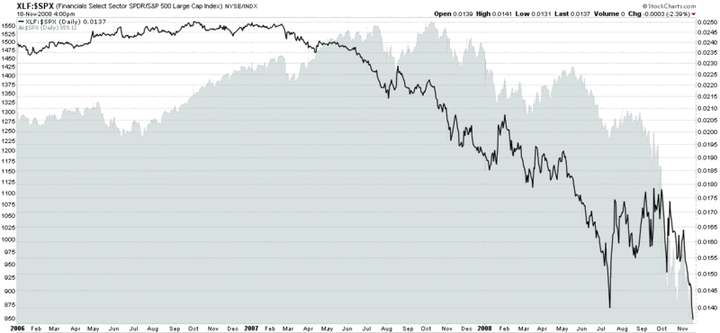
The sector ETFs are off to a slower start. These include the large cap 3x bull (FAS) and large cap -3x bear (FAZ) based on the Russell 1000 financial services index; and the large cap 3x bull (ERX) and large cap bear (ERY) based on the Russell 1000 energy index.

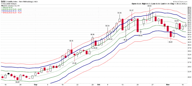
A look at the table below of yesterday’s results shows that these ETFs are like nuclear weapons when it comes to volatility. The average change in these eight ETFs yesterday was a 25% difference from the previous day’s close. ERY closed at 52.44 yesterday. Not only did it lose 28.48 points, but its intra-day range was 35.06 points. It is only a slight exaggeration to say that you can sneeze and miss your position losing ten points. Needless to say, these super-charged ETFs are not for everyone. If you like to go skydiving, keep a pet alligator in the bathtub, and dream of a winter king crab fishing in the Bering Strait, then you will be right at home with the Direxion ETFs.

As I traded these for the first time on yesterday, several interesting things happened. First, just entering a position was an adventure, almost like trying to jump in a Lamborghini while it sped by at 120 mph. I immediately went into position management mode, because the value of my ETF was changing so quickly that it required my full attention. Very quickly, I realized that one cannot trade these triple ETFs without finely honed trading rules and an iron will to act on them at all costs. In this world, there is no room for hoping. Any sort of “it will come back” thinking could quickly turn a 5% loss into a devastating 20% loss. Ironically, the high volatility of these ETFs forces the trader to rely on (or learn) tight trading discipline.

Retail investors might want to take these ETFs out for a test drive too, but be forewarned that there is a disaster scenario looming around every corner. For these very same reasons, I anticipate that hedge funds currently day trading options will find these ETFs to their liking, particularly as volume and liquidity improve. In a deleveraging world, this is one way to stock up on “off balance sheet leverage” and get the extra juice without having to commit to the extra margin.

Not that extra leverage is usually a good thing…
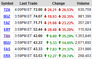
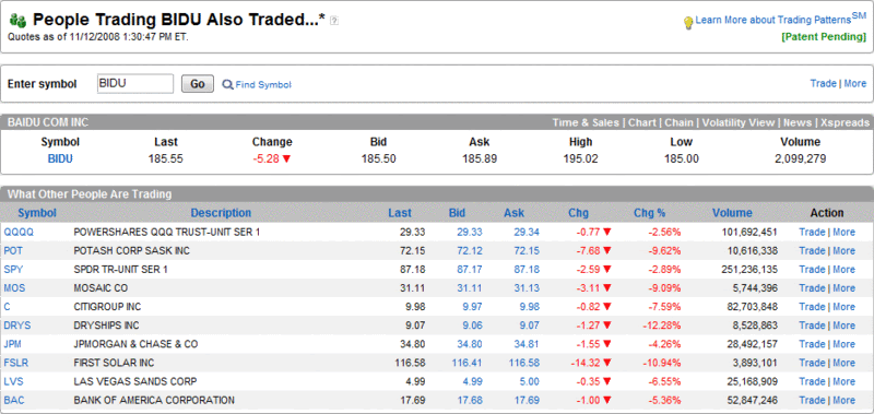
[source: Yahoo]

Thursday, November 13, 2008

VXV Is One Year Old

One year ago the CBOE launched the VXV, which is a variant of the VIX that calculates implied volatility in SPX options over the course of the next 93 days instead of the 30 day time window used by the VIX.

In December 2007, with the VXV less than one month old, I went out on a limb and suggested in The VIX:VXV Ratio that comparing the relative levels in the VIX and VXV might serve as an important market timing signal in a way that is analogous to VIX term structure data.

Much to my delight, from November 2007 through the Lehman Brothers bankruptcy in September 2008, the VIX:VXV ratio performed nearly flawlessly, generating timely buy and sell signals. In a post-Lehman world, however, the VIX:VXV ratio has struggled with a bullish bias as the markets have headed down.

In the chart below I present my original thinking from December 2007 of how the VIX:VXV might be applied. Since that time, I have made a number of enhancements for my personal use that I have yet to post about on the blog. A couple of those enhancements now suggest that the pre-Lehman threshold levels such as 1.10 and 0.90 are once again relevant. This would make the current VIX:VXV ratio of 1.12 an excellent buying opportunity.

For a long time, I was the only person who talked about the VIX:VXV ratio. Over the course of the past year, however, it has generated a strong following. Now that readers have a year of data to digest and a broad range of market conditions in which to evaluate the indicator, what enhancements or modifications to the VIX:VXV ratio would you suggest? Feel free to discuss this in the comments section below.

[source: StockCharts]

Wednesday, November 12, 2008

People Trading BIDU Also Traded…

Back in September 2007, I started periodically posting snapshots from the optionsXpress Trading Patterns feature and chose to highlight the highly speculative Chinese internet search firm, Baidu (BIDU), then trading at 299, as my guinea pig. Over the course of seven months, I twice updated what traders who traded BIDU were also trading at optionsXpress when BIDU was at 380 on 10/30/2007 and when it was at 350 on 4/22/2008.

I just captured the most recent Trading Patterns update, which shows traders who are trading BIDU (currently at 185) are still active in the most volatile names in agriculture, financials, shipping, solar, and casinos. The stocks on the top ten list: Potash (POT), Mosaic (MOS), Citigroup (C), JPMorgan Chase (JPM), Bank of America (BAC), DryShips (DRYS), First Solar (FSLR), and Las Vegas Sands (LVS). Also on the list are two ETFs, QQQQ and SPY. Either optionsXpress customers have been cleaning up on the short side or they are a little early to the bull party.

[source: optionsXpress]

Recent VIX Activity in the Context of Moving Average Envelopes

I have been receiving quite a few questions about the VIX lately. These are usually of the “where is it going?” or “what does it mean?” variety, but also quite a few from the do-it-yourself crowd who want to know how to best chart the VIX.

Though it may not always appear to be the case in this space, I am a big proponent of keeping things simple. The chart below is one simple approach to thinking about the VIX. The chart utilizes three different moving average envelopes to track where the VIX is relative to its 10 day simple moving average. Unlike Bollinger bands, which expand and contract according to recent volatility trends, the moving average envelopes define fixed percentage deviations from the moving average. In the case of the chart below, the dotted green line in the center is the 10 day SMA, the solid green lines represent a 10% moving average envelope, the bold dark blue lines mark the 20% envelope, and the dotted red lines are 30% above and below the 10 day SMA.

In terms of interpretation, consider that the VIX spends of most of its life between the 10% envelopes (e.g., late August, last few days) and generally strays only briefly out of the 20% envelopes before being pulled back by mean reversion. Of course the recent historic highs in volatility had the VIX above the top of the 20% envelope for almost all of September and October and then dramatically reversing to below the bottom of the 20% envelope last week. For any time other than the recent market activity, the 30% envelopes are superfluous. Historically, these are breached about once per year and almost always when the VIX spikes up.

[source: StockCharts]

Tuesday, November 11, 2008

Extremes in the Spread Between the VIX and 20 Day Historical Volatility in the SPX

In the comments section in yesterday’s The Spread Between the VIX and 20 Day Historical Volatility in the SPX, über reader Frank shared his analysis of the VIX relative to the 20 day historical volatility (HV) of the SPX. Frank’s conclusion is that when the spread between the VIX and the SPX's 20-day HV is one standard deviation or more below the average from the previous year, the SPX is much more likely to close down in the next five days than when the spread is one standard deviation or more above the previous year’s average.

I have examined a number of data sets involving the VIX and various HV calculations for the SPX, including 20 day HV. My findings support the idea that when the difference between the VIX and the 20 day HV is at historically high levels, the SPX is much more likely to outperform over the course of the next couple of weeks. Similarly, when the spread is at historically low levels, the SPX is more likely to underperform going forward. For reasons likely related to VIX mean reversion, a high spread is a more robust signal than a low spread.

Since the spread demonstrates a tendency to trend, I have applied some smoothing factors to the spread and compared the spread to its various moving averages. In so doing, I have determined that the absolute level of the spread is less important than the differential between the spread and its moving averages. Finally, and getting back to Frank’s original point, I was surprised to discover that extremes in the difference between the spread and the moving averages (both at the high end and low end) offer very little information about the future direction of the SPX.

Monday, November 10, 2008

The Spread Between the VIX and 20 Day Historical Volatility in the SPX

In the last few weeks I have received a lot of positive feedback on my posts about the VIX and historical volatility in the SPX. For those who may have missed it, you may wish to start with The VIX in the Context of Historical Volatility in the SPX and The VIX – SPX 30 Day Historical Volatility Spread and Performance.

Today Todd Salamone of SchaeffersResearch.com has a Monday Morning Outlook post in which he observes:

“We are also closely watching the behavior of the CBOE Market Volatility Index (VIX – 56.10) from 2 perspectives. First, the VIX continues to trade at a steep discount to the SPX's 20-day historical volatility, which has begun to level off just above 80% during the past few weeks. Our interpretation of this development is that there is little fear of another major setback in the market. Typically, such fear leads to major market bottoms. If fear and panic were elevated, the VIX would be trading above the actual volatility of the SPX.

Second, we are keeping an eye on the 44-45 area in regard to the VIX. We think this area is important, as it marked last week's low, and represents the VIX's "half-high" achieved on October 24. Moreover, this area is currently home to the VIX's rising 50-day moving average.”

While both points are interesting ones, it is the historical volatility piece that I wish to comment on here. Starting with some history, since 1990 the VIX has traded above the 20 day historical volatility of the SPX over 90.6% of the time, often in an uninterrupted fashion for months on end. The fact that the VIX is above 20 day historical volatility, therefore, says very little about elevated levels of fear and panic.

In the chart below, I have plotted the VIX minus the 20 day historical volatility in the SPX (expressed as a percentage of the VIX) from 2007 through Friday. In the chart, it is evident that when the VIX-HV is high, this generally tends to coincide with short-term bottoms in the SPX. The low levels of VIX-HV are not as easy to decipher. The two most dramatic VIX-HV lows on the chart both occurred after a low in the SPX and coincided with a several month uptrend in the SPX.

In the current environment, I would consider Tuesday’s record low in the VIX-HV ratio to be a signal that a near-term bottom is in the process of forming. I do not, however, see the need for the VIX to trade above the SPX’s 20 day historical volatility, as it did for one day on October 27th for instance, to provide any confirmation signal.

[source: VIX and More]

Friday, November 7, 2008

VIX Jumps 10% on Consecutive Days

In most of the world, yesterday’s big news was that the S&P 500 index fell 5% for the second day in a row. Here at VIX Central, I was also interested to note that the VIX jumped 10% for the second day in a row, something that has happened on nine previous occasions going back to 1990.

From a market timing perspective, the history of consecutive double digit jumps in the VIX does show a significant bullish bias going forward, but not one that develops until after the first day. In the graphic below, courtesy of Yahoo, I have also put these nine double jumps into historical perspective by marking them with blue arrows. These double jump days do tend to appear at important inflection points, but these are not necessarily at reversals, nor are they necessarily associated with bull markets. On balance, however, I would consider this double jump VIX activity to be a bullish development.

[source: Yahoo]

Thursday, November 6, 2008

VIX Rallies to 10 Day Moving Average

The VIX has rallied right up to the 10 day simple moving average (63.90) today and appears to be hitting some resistance in that area.

Traditional VIXology says that the VIX and SPX should be in a neutral zone when the VIX is near the 10 day SMA.

It will be interesting to see if the remaining bulls are willing to step in at current levels.

AMEX Ready to Pull the Plug on Fixed Return Options?

Stan Freifeld at TheOptionsInsider.com has crafted the first draft of an obituary for fixed return options, also known as FROs. In The Death of Fixed Return Options? Freifeld concludes that the absence of new expirations months and strikes suggests the AMEX is likely to phase out FROs soon.

While clearly a fan of FROs, Freifeld highlights six issues which have hampered the development of these new types of options:

  1. New nomenclature required (Finish High and Finish Low)
  2. Large bid/ask spreads
  3. Product not aggressively marketed by the AMEX
  4. Limited availability via brokers
  5. Available on only one exchange (AMEX), with low volume
  6. Utilizes volume-weighted average price (VWAP) for settlement, instead of closing price

I think the salient points are captured above, but ultimately FROs are doomed by the lack of availability via brokers and particularly the large bid/ask spreads. These two issues may be a function of marketing, nomenclature, a single exchange approach or other factors, but ultimately if the spreads are too large, then it becomes extremely difficult to implement a strategy which can overcome such large transaction costs over the long term.

“Fixed return options” is the name the AMEX gives to their all-or-nothing options products. The CBOE uses the term “binary options” for similar options they offer on the SPY and VIX. While SPY binary options are generating some interest, at the money spreads are still in the 0.06 – 0.08 range, which is discouraging a more active market.

Further to my VIX Binary Options post of two months ago, VIX binaries continue to suffer from a lack of interest. This is unfortunate, because in many respects VIX binary options are in much easier to understand and potentially to trade successfully than standard VIX options.

Students of volatility derivatives may recall that the Deutsche Börse launched futures on the VDAX known as the VOLAX back in 1998. While that product launch was not successful, it did pave the way for a successful launch of VIX futures six years later.

Wednesday, November 5, 2008

VIX Way Below 10 Day SMA

Rob Hanna at Quantifiable Edges has a study up this morning with the title VXO Suggesting A Pullback Is Likely. In his previous Is A Low VIX A Short Trigger? Rob concluded, contrary to popular wisdom and quite correctly:

“Owning the S&P 500 when the VIX was more than 10% below its 10-day moving average was significantly more profitable on average than owning it when it wasn’t.”

Quoting Rob again, the important distinction to make is that “when the VXO becomes extremely stretched, as it is now, then that changes,” with an extremely low VXO “very suggestive of short-term bearish implications.” [Emphasis in the original]

My initial thought upon reading this is to recall an important VIX heuristic that VIX trades have a higher expectancy when the VIX is extended to the upside than to the downside. My second thought was that the reason the VIX (or VXO) typically gets extremely extended to the downside – at least relative to a 10 day moving average – is that volatility is usually reversing a large upward spike.

My research shows that since 1990, the 30 instances in which the VIX was lowest relative to its 10 day moving average (at least 18% below it) were good times to be long the market, on average. In the one to two week time frame following the relative low readings in the VIX, there was small advantage to being in the markets; after two weeks or so, the advantage for longs becomes more pronounced.

The bottom line is that while the VIX and VXO are well below their 10 day moving averages (yesterday was a record in that regard for the VIX), just last week they were extremely extended above their 10 day moving averages. This week’s extreme readings are as much a residual effect of the extreme readings in the opposite direction as anything else. For now the VIX looks to be in a range that is consistent with macroeconomic conditions, futures prices, and recent volatility. For those that follow the VIX:VXV ratio, it is currently at 1.03, also suggesting that volatility readings are in a ‘normal’ range given current circumstances.

Tuesday, November 4, 2008

VIX Below 45 For First Time Since October 3rd

Just for the record, the SPX traded between 1098 and 1153 on October 3, 2008. On that same day the DJIA traded between 10,261 and 10,844. Even after this morning's bullish move, each index would need to jump about another 10% before they reached their October 3 trading ranges.

The VIX and Lagging Historical Volatility

By definition, historical volatility will always be backward looking and lag the real-time volatility environment. When volatility trends, as it has over the course of the past two months, this phenomenon is less evident. In the current market environment, however, where both stocks and implied volatility measures such as the VIX are reversing, many measures of historical volatility begin to seem no more useful than driving on a winding road using the rear view mirror.

The graph below shows that while the 30 day historical volatility in the SPX peaked a week ago, it has only fallen 4% since that time. Not surprisingly, the 50 day historical volatility measure has been even less responsive to recent market changes and has entered a plateau phase, seemingly oblivious to the recent changes in volatility. By contrast, the 10 day historical volatility measure has dropped 27%; it has more accurately mirrored the VIX and perhaps even hinted at a coming VIX reversal when it topped three days before the VIX did.

Ten day historical volatility is erratic and prone to readings that reflect a low signal to noise ratio. When volatility is changing quickly, however, 10 day historical volatility is frequently a better proxy for the VIX and a more meaningful baseline for comparison than its 30 day sibling.

[source: VIX and More]

Monday, November 3, 2008

The VIX - SPX 30 Day Historical Volatility Spread and Performance

Two weeks ago in The VIX in the Context of Historical Volatility of the SPX, I used a chart to demonstrate how the VIX (which is essentially the implied volatility of the SPX) compares across various SPX historical volatility lookback time frames.

Why should anyone care about this? Well, it just might be worth noting that in the 19 year history of the VIX, four of the eight largest negative divergences between the VIX and the SPX 30 day historical volatility have occurred in the past two weeks (the other four were from August 2002). Looking back at the history of these negative divergences, they have regularly occurred just before substantially below average market performance. The 14 instances in which the VIX was at least 10 points below the 30 day historical volatility of the SPX, for instance, resulted in an average loss of 8.6% in the next 20 days. The 76 instances in which the VIX was at least 5 points below the 30 day HV of the SPX produced an average return of -1.2% in the next 20 days.

If you look at positive divergences, the story is the exact opposite. The 29 instances in which the VIX was at least 15 points higher than the 30 day HV of the SPX led to a 6.6% return over the course of the next 20 days. For 67 instances in which the VIX was 12.5 points higher than the SPX’s 30 day HV, the 20 day return was 4.5%.

Before one jumps to conclusions about the current environment, it is worth noting that on October 10th, the spread between the VIX and the 30 day HV of the SPX was 16.2 (and the SPX jumped 11.6% the next day.) Friday marks the 20th trading day since this signal. Is it possible that the VIX spread will begin to create a strong downward pull on the markets by the end of the week?

Sunday, November 2, 2008

Subscriber Newsletter Enhancements

Just a quick note to let those who are interested know that the subscriber newsletter has received considerable reader feedback and made a number of changes in October. Perhaps the biggest change is to expand the scope of the newsletter (which already had a broader reach than this blog) to focus more on macroeconomic and fundamental issues, provide a stronger global perspective, and make an effort to highlight more high potential stocks and ETFs.

A subscriber newsletter blog recaps the newsletter content each month and provides updates on several model portfolios the newsletter tracks, including a Stock of the Week selection that has a cumulative gain of 90% since the newsletter was launched on March 30, 2008.

If anyone has any questions about the subscriber newsletter, or is interested in reviewing a sample, please feel free to email me at bill.luby@gmail.com

DISCLAIMER: "VIX®" is a trademark of Chicago Board Options Exchange, Incorporated. Chicago Board Options Exchange, Incorporated is not affiliated with this website or this website's owner's or operators. CBOE assumes no responsibility for the accuracy or completeness or any other aspect of any content posted on this website by its operator or any third party. All content on this site is provided for informational and entertainment purposes only and is not intended as advice to buy or sell any securities. Stocks are difficult to trade; options are even harder. When it comes to VIX derivatives, don't fall into the trap of thinking that just because you can ride a horse, you can ride an alligator. Please do your own homework and accept full responsibility for any investment decisions you make. No content on this site can be used for commercial purposes without the prior written permission of the author. Copyright © 2007-2023 Bill Luby. All rights reserved.
 
Web Analytics